Bottom App Bar
底部应用栏,主要用来显示导航和一些关键操作
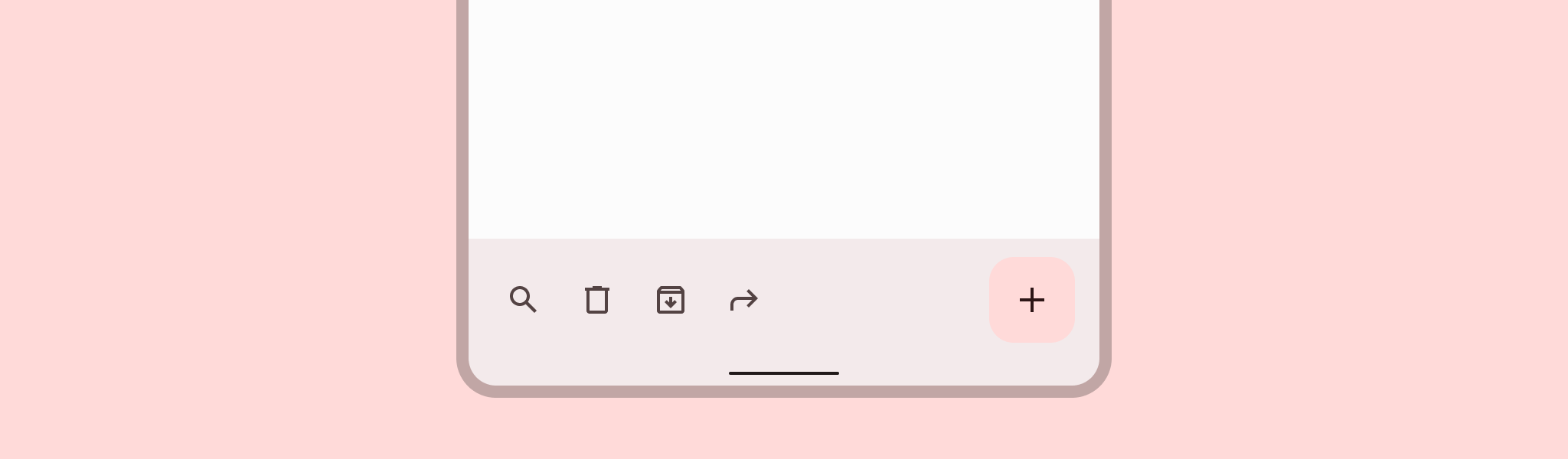
底部应用栏提供最多四个操作的访问,包括浮动操作按钮(FAB)。
设计和API文档
使底部应用栏易于访问
Android的底部应用栏组件API支持导航图标、操作项、溢出菜单等功能,以告知用户每个操作的作用。虽然这些功能是可选的,但强烈建议使用它们。
内容描述
在使用导航图标、操作项和底部应用栏的其他元素时,您应该为它们设置内容描述,以便像TalkBack这样的屏幕阅读器能够宣布它们的目的或操作。
对于底部应用栏的整体内容描述,设置android:contentDescription或在BottomAppBar上使用setContentDescription方法。
对于导航图标,使用app:navigationContentDescription属性或setNavigationContentDescription方法。
对于操作项和溢出菜单中的项,在菜单中设置内容描述:
<menu ...>
    ...
    <item
          ...
          android:contentDescription="@string/content_description_one" />
    <item
          ...
          android:contentDescription="@string/content_description_two" />
</menu>
示例
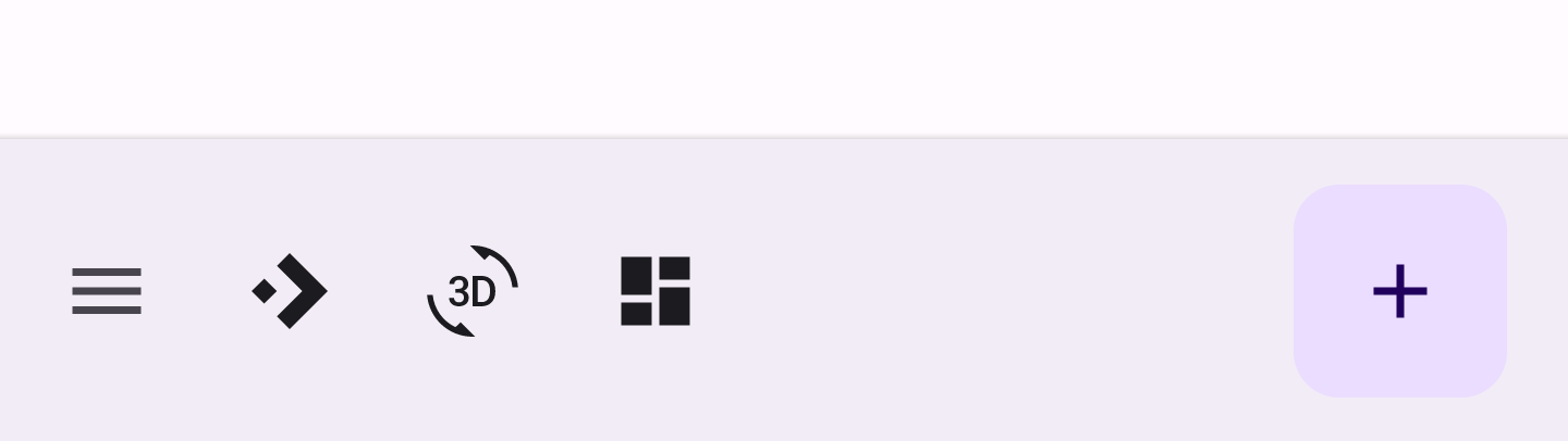
以下示例显示了一个底部应用栏,其中包含导航图标 3 个操作 图标和嵌入式 FAB.
在布局中:
<androidx.coordinatorlayout.widget.CoordinatorLayout
    ...
    android:layout_width="match_parent"
    android:layout_height="match_parent">

    <!-- 注意:也可以使用RecyclerView -->
    <androidx.core.widget.NestedScrollView
        android:layout_width="match_parent"
        android:layout_height="match_parent"
        android:paddingBottom="100dp"
        android:clipToPadding="false">

        <!-- 可滚动内容 -->

    </androidx.core.widget.NestedScrollView>

    <com.google.android.material.bottomappbar.BottomAppBar
        android:id="@+id/bottomAppBar"
        android:layout_width="match_parent"
        android:layout_height="wrap_content"
        android:layout_gravity="bottom"
        style="@style/Widget.Material3.BottomAppBar"
        app:navigationIcon="@drawable/ic_drawer_menu_24px"
        app:menu="@menu/bottom_app_bar"
        />

    <com.google.android.material.floatingactionbutton.FloatingActionButton
        android:layout_width="wrap_content"
        android:layout_height="wrap_content"
        app:srcCompat="@drawable/ic_add_24dp"
        app:layout_anchor="@id/bottomAppBar"
        />

</androidx.coordinatorlayout.widget.CoordinatorLayout>
在 menu/bottom_app_bar.xml 中:
<menu
      ...>
    <item
      android:id="@+id/accelerator"
      android:icon="@drawable/ic_accelerator_24px"
      android:title="@string/accelerator"
      android:contentDescription="@string/content_description_accelerator"
      app:showAsAction="ifRoom"/>

    <item
      android:id="@+id/rotation"
      android:icon="@drawable/ic_3d_rotation_24px"
      android:title="@string/rotation"
      android:contentDescription="@string/content_description_rotation"
      app:showAsAction="ifRoom"/>

    <item
      android:id="@+id/dashboard"
      android:icon="@drawable/ic_dashboard_24px"
      android:title="@string/dashboard"
      android:contentDescription="@string/content_description_dashboard"
      app:showAsAction="ifRoom"/>

</menu>
在菜单/导航图标的drawable中:
<vector
    ...
    android:tint="?attr/colorControlNormal">
    ...
</vector>
在代码中:
bottomAppBar.setNavigationOnClickListener {
    // 处理导航图标按下事件
}

bottomAppBar.setOnMenuItemClickListener { menuItem ->
    when (menuItem.itemId) {
        R.id.accelerator -> {
            // 处理加速器图标按下事件
            true
        }
        R.id.rotation -> {
            // 处理旋转图标按下事件
            true
        }
        R.id.dashboard -> {
            // 处理仪表盘图标按下事件
            true
        }
        else -> false
    }
}
应用滚动行为到底部应用栏
以下示例显示了在向下滚动可滚动内容时底部应用栏隐藏,并在向上滚动时出现。
<androidx.coordinatorlayout.widget.CoordinatorLayout
    ...>
    ...
    <com.google.android.material.bottomappbar.BottomAppBar
        ...
        app:hideOnScroll="true"
        />
    ...
</androidx.coordinatorlayout.widget.CoordinatorLayout>
结构和关键属性说明
底部应用栏有一个容器和一个可选的导航图标、锚定的浮动操作按钮(FAB)、操作项和溢出菜单。
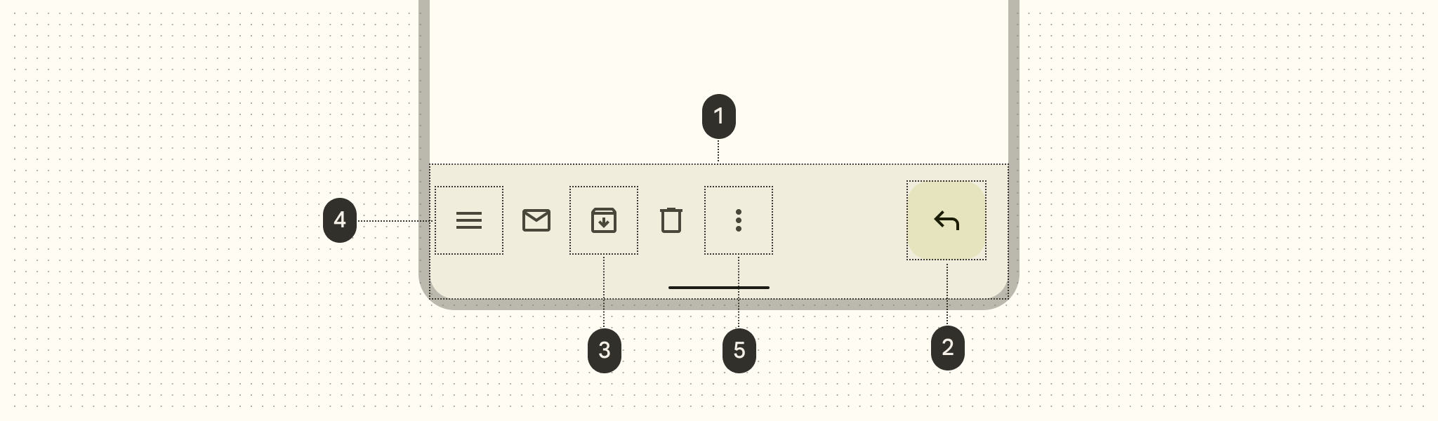
- 容器
- 浮动操作按钮(FAB)(可选)
- 操作项(可选)
- 导航图标(可选)
- 溢出菜单(可选)
容器属性
| 元素 | 属性 | 相关方法 | 默认值 |
|---|---|---|---|
| 颜色 | app:backgroundTint | setBackgroundTintgetBackgroundTint | ?attr/colorSurfaceContainer |
| Elevation | app:elevation | setElevation | 3dp |
| 高度 | android:minHeight | setMinimumHeightgetMinimumHeight | 80dp |
| 阴影 | app:addElevationShadow | N/A | false |
导航图标属性
| 元素 | 属性 | 相关方法 | 默认值 |
|---|---|---|---|
| 图标 | app:navigationIcon | setNavigationIcongetNavigationIcon | null |
| 颜色 | app:navigationIconTint | setNavigationIconTint | ?attr/colorOnSurfaceVariant (as Drawable tint) |
FAB 属性
| 元素 | 属性 | 相关方法 | 默认值 |
|---|---|---|---|
| 对齐模式 | app:fabAlignmentMode | setFabAlignmentModegetFabAlignmentMode | end |
| 动画模式 | app:fabAnimationMode | setFabAnimationModegetFabAnimationMode | slide |
| 锚定模式 | app:fabAnchorMode | setFabAnchorMode getFabAnchorMode | embed |
| 托架边距 | app:fabCradleMargin | setFabCradleMargingetFabCradleMargin | 6dp |
| 托架圆角半径 | app:fabCradleRoundedCornerRadius | setFabCradleRoundedCornerRadiusgetFabCradleRoundedCornerRadius | 4dp |
| 托架垂直偏移 | app:fabCradleVerticalOffset | setCradleVerticalOffsetgetCradleVerticalOffset | 12dp |
| 结束边距 | app:fabAlignmentModeEndMargin | setFabAlignmentModeEndMargin getFabAlignmentModeEndMargin | 16dp |
| 嵌入的高度 | app:removeEmbeddedFabElevation | N/A | true |
有关更多属性,请参见 FAB文档。
操作项属性
| 元素 | 属性 | 相关方法 | 默认值 |
|---|---|---|---|
| 菜单 | app:menu | replaceMenugetMenu | null |
| 图标颜色 | N/A | N/A | ?attr/colorControlNormal (作为 Drawable 的色调) |
| 对齐模式 | app:menuAlignmentMode | setMenuAlignmentMode getMenuAlignmentMode | start |
溢出菜单属性
| 元素 | 属性 | 相关方法 | 默认值 |
|---|---|---|---|
| 图标 | android:src and app:srcCompat in actionOverflowButtonStyle (in app theme) | setOverflowIcongetOverflowIcon | @drawable/abc_ic_menu_overflow_material (before API 23) or @drawable/ic_menu_moreoverflow_material (after API 23) |
| 主题 | app:popupTheme | setPopupThemegetPopupTheme | @style/ThemeOverlay.Material3.* |
| 项排版 | textAppearanceSmallPopupMenu and textAppearanceLargePopupMenu in app:popupTheme or app theme | N/A | ?attr/textAppearanceTitleMedium |
样式
| 元素 | 样式 |
|---|---|
| 默认样式 | Widget.Material3.BottomAppBar |
默认样式主题属性: bottomAppBarStyle
底部应用栏主题
底部应用栏支持 Material主题 ,可以自定义颜色、排版和形状。
底部应用栏主题示例
API和源代码:
以下示例显示了一个带有Material主题的底部应用栏。
实现底部应用栏主题
在 res/values/styles.xml 中使用主题属性,这将主题应用于所有底部应用栏和FAB,并影响其他组件:
<style name="Theme.App" parent="Theme.Material3.*">
    ...
    <item name="colorPrimary">@color/shrine_pink_100</item>
    <item name="colorOnPrimary">@color/shrine_pink_900</item>
    <item name="colorSecondary">@color/shrine_pink_50</item>
    <item name="colorOnSecondary">@color/shrine_pink_900</item>
    <item name="textAppearanceTitleMedium">@style/TextAppearance.App.Medium</item>
    <item name="shapeAppearanceSmallComponent">@style/ShapeAppearance.App.SmallComponent</item>
</style>

<style name="TextAppearance.App.Medium" parent="TextAppearance.Material3.TitleMedium">
    <item name="fontFamily">@font/rubik</item>
    <item name="android:fontFamily">@font/rubik</item>
</style>

<style name="ShapeAppearance.App.SmallComponent" parent="ShapeAppearance.Material3.SmallComponent">
    <item name="cornerFamily">cut</item>
    <item name="cornerSize">4dp</item>
</style>
使用默认样式主题属性、样式和主题覆盖,这将主题应用于所有底部应用栏和FAB,但不影响其他组件:
<style name="Theme.App" parent="Theme.Material3.*">
    ...
    <item name="bottomAppBarStyle">@style/Widget.App.BottomAppBar</item>
    <item name="floatingActionButtonStyle">@style/Widget.App.FloatingActionButton</item>
</style>

<style name="Widget.App.BottomAppBar" parent="Widget.Material3.BottomAppBar">
    <item name="materialThemeOverlay">@style/ThemeOverlay.App.BottomAppBar</item>
</style>

<style name="Widget.App.FloatingActionButton" parent="Widget.Material3.FloatingActionButton">
    <item name="materialThemeOverlay">@style/ThemeOverlay.App.FloatingActionButton</item>
</style>

<style name="ThemeOverlay.App.BottomAppBar" parent="">
    <item name="colorPrimary">@color/shrine_pink_100</item>
    <item name="colorOnPrimary">@color/shrine_pink_900</item>
    <item name="textAppearanceTitleMedium">@style/TextAppearance.App.TitleMedium</item>
</style>

<style name="ThemeOverlay.App.FloatingActionButton" parent="">
    <item name="colorSecondary">@color/shrine_pink_50</item>
    <item name="colorOnSecondary">@color/shrine_pink_900</item>
    <item name="shapeAppearanceSmallComponent">@style/ShapeAppearance.App.SmallComponent</item>
</style>
在布局中使用样式,这仅影响此底部应用栏和FAB:
<com.google.android.material.bottomappbar.BottomAppBar
    ...
    style="@style/Widget.App.BottomAppBar"
    />

<com.google.android.material.floatingactionbutton.FloatingActionButton
    ...
    style="@style/Widget.App.FloatingActionButton"
    />
在代码中:
val topEdge = BottomAppBarCutCornersTopEdge(
    bottomAppBar.fabCradleMargin,
    bottomAppBar.fabCradleRoundedCornerRadius,
    bottomAppBar.cradleVerticalOffset
)
val background = bottomAppBar.background as MaterialShapeDrawable
background.shapeAppearanceModel = background.shapeAppearanceModel.toBuilder().setTopEdge(topEdge).build()
⭐ 注意
使用 BottomAppBarCutCornersTopEdge 在圆角形状外观的情况下不是必需的。